
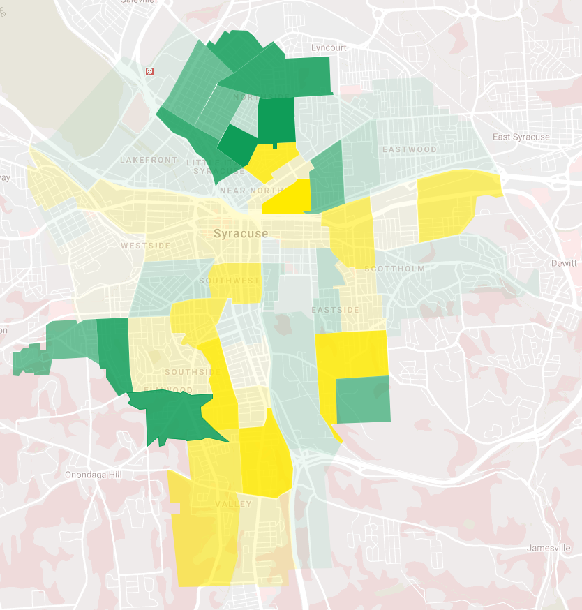
After years of precipitous decline, Syracuse’s overall population has held remarkably steady over the last decade. Between 2010 and 2019, the total number of people living in the City decreased by just 1,890 or 1.3%.
But look at the tract-level data, and it’s clear that Syracuse’s population has been anything but stable. Some neighborhoods boomed, others emptied out. And the compositions of those neighborhoods changed in ways that simple population counts can’t capture.
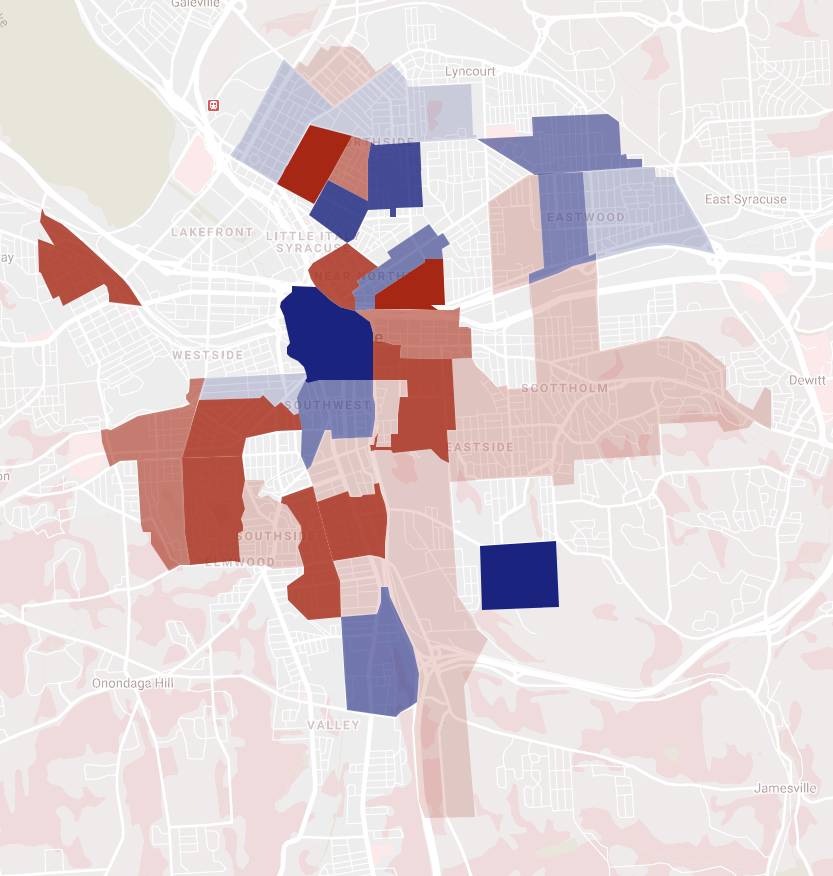
This map shows the change in population for each Syracuse census tract, adjusted for area. Tracts shaded red had fewer people in the 2019 than in 2010, and tracts shaded blue saw population growth.
Much of Eastwood and the Northside grew in the last decade, while the South, East, and West Sides all saw population loss.
The City’s center—Franklin Square, Downtown and University Hill—saw intense growth, but it is somewhat obscured in this map because much of SU’s student population gets counted South Campus and because Franklin Square is just a small part of a huge census tract that also includes the Inner Harbor, Mall, and part of Onondaga Lake.
Syracuse became more diverse between 2010 and 2019. The White share of the city’s population decreased from 59% to 55% over that time. That decrease was driven by a combination of White flight and Black growth in outer neighborhoods on the North, West, and East sides, but it was counteracted by a combination of population loss in some neighborhoods with large Black populations and an increase in the White population in the City’s center.
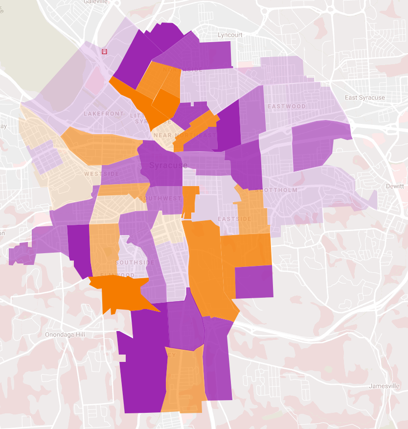
In the City’s center and the outer parts of the North, East, South and West sides, these changes have made neighborhoods more integrated—the racial makeup of those neighborhoods looks more like the City as a whole. But in a few pockets like the near Northside, Tipperary Hill, Park Avenue, the residential ring around Syracuse University, and the Southwest, neighborhoods have become more segregated over the last decade.
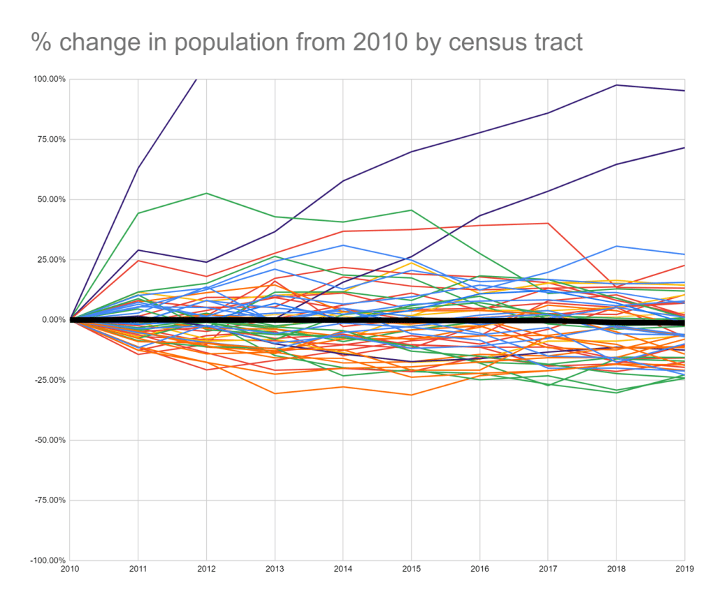
In the graph above, the thick black line represents the City’s population in the decade between 2010-2019. It barely moves from year to year, cutting a straight path across the screen and suggesting that Syracuse has achieved a measure of demographic stability.
All of the colored lines represent population change for each of the City’s 55 census tracts. They riot across the screen, painting a more complicated picture of demographic change. Looking at individual neighborhoods rather than the City as a while complicates the notions that Syracuse’s population has stabilized or that the entire City is trending in one direction or another, and it can point the way towards a future where Syracuse can sustain citywide population growth.
