
Population is a function of two variables: the size of households and the number of households. If households get bigger, population will also grow even if the total number of households remains the same. And if the total number of households increases, population will also grow even if the average size of those households remains the same.
But although these two factors both influence the overall population count similarly, they have very different effects on the demographic reality that underlies that top line figure.
One of the main differences has to do with housing supply, demand, and pricing. If Syracuse’s population change was entirely the result of changing household size, that wouldn’t mean very much for housing prices—a three-person family that becomes a four-person family doesn’t necessarily need a new house, but a block that grows from three one-person households to four one-person households does. If that block doesn’t get a fourth house, then the household that gets left out is likely to be the one that can afford the least in rent.
This simple story played out over and over again across Syracuse between 2010 and 2019.

Changes in the number of households largely reflect changes in the population across the City. Between 2010 and 2019, Syracuse’s overall population decreased by 1.3%, and the total number of households decreased by 2.1%
The neighborhoods that gained the most households (teal on the map) were Eastwood, the Eastside between Westcott and 690, Elmwood, University Hill, Downtown and Franklin Square. Neighborhoods that lost households (orange on the map) were the Southside along Midland Ave, the Westside along Onondaga and Geddes Streets, parts of the near Northside, and the vast majority of the Eastside.

There was very little change in the total number of housing units in Syracuse (just a 3% increase overall) because the City is “built out” in the sense that it’s extremely difficult—from both a legal and financial standpoint—to construct new housing in old city neighborhoods.
Across the City, the vast majority of census tracts saw minor variations in available housing stock. A few dozen homes added to or removed from neighborhoods that house several thousand people. The only major areas of growth (purple on the map) were Franklin Square and University Hill, two neighborhoods that, taken together, saw a 32% increase in the number of housing units available between 2010 and 2019.
Decline was more widespread (yellow on the map), as would be expected in a City with a slightly shrinking population where it’s easier—and a matter of government policy—to demolish old buildings than it is to build new ones.
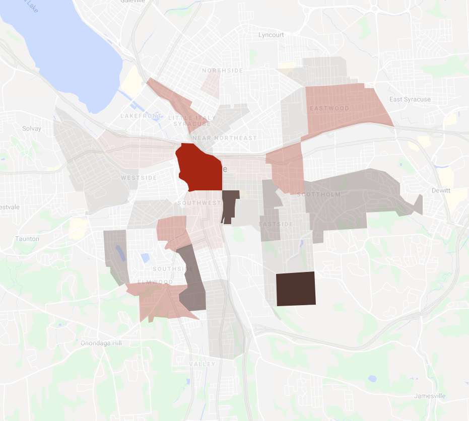
Combine those two measures—total number of households and total number of housing units—and you get the vacancy rate: the percentage of unoccupied housing units in an area. This map shows census tracts where the vacancy rate decreased in red, and those where it increased in brown. So much of the map is lightly shaded because changes in the number of households and housing units tracked pretty well across most of the city—where new families moved, new housing was built, where families left, housing was demolished. The City’s built environment adapted to its changing demographic reality.
A great example of this adaptation is Franklin Square. That census tract saw huge growth in the number of households over the last decade (54%), but it also saw a similarly large increase in the number of housing units (59%), so the vacancy rate barely changed (+3%).
The real outlier is Downtown, where the total number of households increased by 43%, but the number of housing units available only increased by 6%, so the vacancy rate decreased by 24%.

And changes in vacancy rate translate pretty well to changes in the cost of rent. Although Franklin Square and Downtown occupy a similar place in Syracuse’s housing market—in terms of who’s moving there, what kind of housing they’re looking for, the intensity of population growth—median rent in Franklin Square actually decreased by 5% between 2010 and 2019 relative to the rest of Syracuse, while median rent Downtown increased by 33% over that same time.
For the most part, this same pattern holds elsewhere: rents went up where the vacancy rate dropped, and dropped where the vacancy rate went up.
