All posts by inthesaltcity

How to build bus ridership

Syracuse needs more people riding the bus. Increased ridership is good for Centro, obviously, because it provides increased fare revenue and a broader base of political support for public transportation. But increased ridership would also indicate that Centro is serving Syracuse better, because more people are choosing to ride.

So how do we do it?

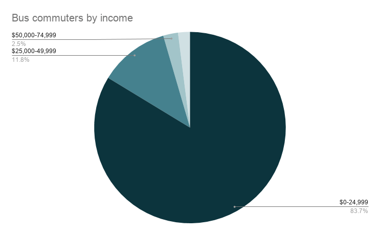
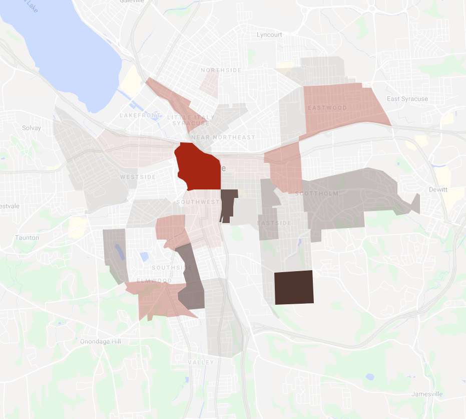
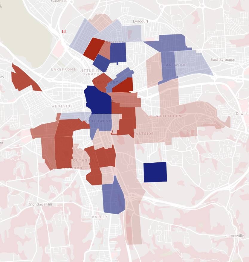
Here’s a breakdown of Centro’s commuter ridership by income. People making less than $25,000 a year account for 84% of Centro’s Syracuse-based commuter ridership. People making more than $50,000 a year account for less than 5% of workers who live in Syracuse and commute by bus.

One approach to building ridership—the ‘captive-choice’ approach—tries to even out the pieces of that pie. 84%(!) of riders are poor—so the thinking goes—because low income correlates with other factors—like lack of access to a car—that constrain people’s transportation options and force them to ride the bus. People making less than $25,000 a year are “captive” riders, and so Centro can count on their ridership no matter what.

High income earners, on this theory, are “choice” riders—they have lots of options for getting around and will only choose the bus if it’s the most attractive option. Current bus service is obviously not an attractive option because high income workers don’t ride, so the answer is to cater service specifically to them. That’s the SYRculator: a high-frequency route that loops around Downtown’s high-priced apartments and office buildings while avoiding all the “captive” riders who pass through the Hub.

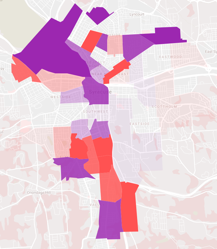
Centro serves 38% of workers in its “captive” market—those who make less than $25,000 and commute by some means other than a car. If Centro ‘evened out’ its performance by capturing 38% of the non-car-commuting population across all incomes, it would increase the total number of people who commute by bus by 43%. 

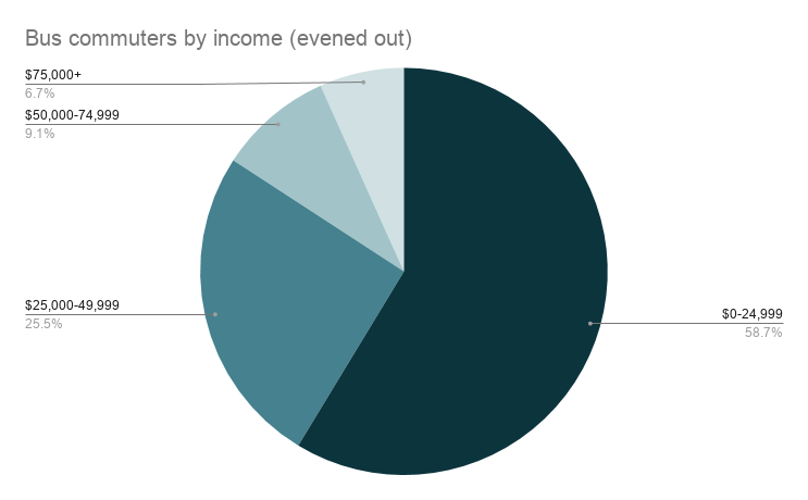
But even in this extremely unlikely scenario (quintupling the number of bus commuters earning more than $50,000), workers making less than $25,000 would still account for 59% of regular bus commuters. There just aren’t that many people making lots of money for whom it would make sense to ride the bus. In part, that’s because there aren’t that many people making lots of money, period. And in part, it’s because the people who do make that much money own multiple cars, and for the foreseeable future driving a car will never be less convenient than riding the bus.

But to even frame the question in terms of individuals making choices shows what’s wrong with the entire captive-choice analysis: every person has a choice, there are no ‘captive’ riders, and there are lots of low income people who currently choose not to ride the bus but who would if it met their needs better.

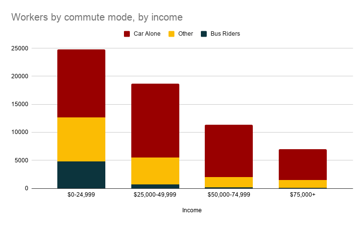
Here’s a graph showing the total number of workers living in Syracuse according to income. Within each bar, the different colors show how different riders commute. Blue is current bus commuters, and red is commuters who drive and are extremely unlikely to switch to riding the bus. Yellow is people who commute on foot, on bike, by taxi, or by sharing a ride, and it represents Centro’s best chance at ridership growth

Workers earning less than $25,000 make up about half of all workers in that yellow area, and so although that population already accounts for 84% of Centro’s current commuter ridership, it also is the portion of the working population with the greatest potential for ridership growth.

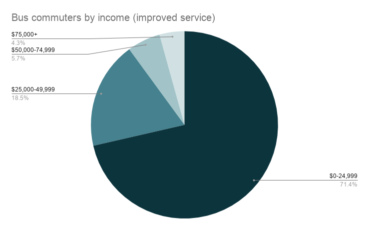
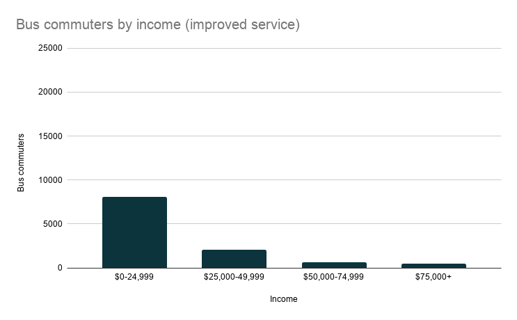
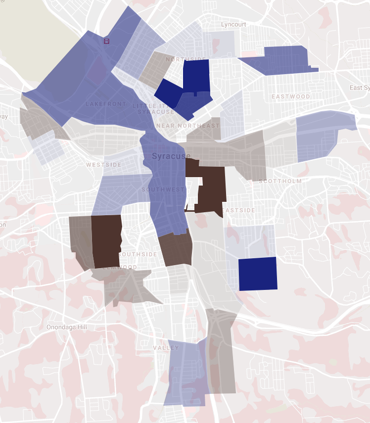
‘Evening out’ ridership across all incomes increased the share of non-car commuters who make between $25,000 and$50,000 by about 26 percentage points. If Centro improved service and enticed enough riders to see a proportional increase in ridership across all incomes, it would increase overall ridership by 96% (twice as much as ‘evening out’ performance among high earners).

57% of that increase would come from workers making less than $25,000. There are just so many low income workers, and so many of them have limited access to a car, that Centro could see huge ridership gains if it simply focused on serving the City’s poorest neighborhoods better.

And the best part is that we already have a plan to do that. It’s Bus Rapid Transit, and for all of the branding and the technology and the hype, the core of the idea is that Centro should spend every extra dollar improving service on the lines that already carry lots of people. Those lines run through neighborhoods with lots of potential bus riders, they connect to places with lots of jobs, and if they ran faster, more frequently, and more reliably, more people in those neighborhoods would use them. That’s how you build ridership.

A bus line for no one

It’s unclear exactly who is supposed to ride Centro’s new Downtown circulator route—a 2-mile figure-8 loop that winds its way from the Tech Garden to Dinosaur BBQ and back.

It can’t be people who live Downtown. The residential population is growing because the neighborhood is so famously easy to walk around. There’s no need to get in the car or wait for the bus to get from Hanover Square to Salt City Market—you can just walk there. A potentially actually useful bus service for Downtown residents would connect them to the City’s other neighborhoods, but this circulator route doesn’t do that because it never leaves Downtown.

It can’t be Centro’s regular riders. The circulator very pointedly avoids interacting with the Hub, and anyway, anybody who rides a bus into Downtown already has ample options for getting themselves around Downtown using Centro’s existing bus lines. This circulator route doesn’t add any new options for regular bus riders.

It can’t be people who drive into Downtown for entertainment. Anybody who shows up in a car has to put it someplace, and they might as well park it where they’re going. Even if they plan to move around Downtown—drinks at Hanover Square and then a hockey game at the War Memorial, maybe—the bus still isn’t much help because after riding from the restaurant to the theater, they’d have to ride back to pick up the car, and this bus doesn’t run past 7pm.

It can’t be commuters. The route doesn’t even start running until 11am.

It’s hard to imagine who would have a transportation problem that this circulator could possibly solve. But to even ask that question you’d have to think like a bus rider, and not many people in positions of power think like that because not many people in positions of power ride the bus. The officials who pushed this new service do not, in their daily personal lives, have to worry about what it would take for a bus line to make life easier, and so their reasoning on this issue is not much more sophisticated than this: “Downtown is booming, Downtown is success, a Downtown bus will succeed!”

If anyone involved had taken a moment to consider the service from the point of view of someone who might actually ride it, then they would have seen that the Downtown circulator will not serve a need, that it is a waste of money, and—because Centro’s budget is not unlimited—wasted money means worse service on the lines that people actually ride. Syracuse will never get the public transportation system that this City needs and deserves until someone with the power to make decisions at Centro takes the perspective of a bus rider.

Downtown’s suburban population

We’ve all heard about Downtown’s growing residential population, but the most recent census figures only put the neighborhood at 3,298 permanent residents. That’s just 2.3% of Syracuse’s entire population, and it’s far fewer people than live in Eastwood, the Southside, Westcott, or just about any other city neighborhood. If Downtown were a village, it’d be medium sized for Onondaga County—bigger than Liverpool, but smaller than Fayetteville and less than half as large as Baldwinsville.

Downtown’s village-sized residential population is dwarfed by the roughly 20,000 people who commute into the neighborhood for work. 78% of those workers live outside of the City. The Downtown that exists during the workday—the Central Business District filled with commuters—disappears at night and on the weekends when its primarily suburban population is absent.

This same pattern repeats itself at festivals like the Taste of Syracuse, and entertainment events like Symphoria concerts. These crowds sustain Downtown’s businesses, its infrastructure, its vitality—they’re what make Downtown different from other city neighborhoods and the villages that its purely residential population otherwise resembles.

But they also mean that when there are lots of people Downtown, a majority of them likely live outside the City, and that throws a lot of Downtown-specific policy choices into a new light. City tax cuts for Downtown companies often go to supporting suburban households. Panhandling bans protect suburban visitors from having to interact with city residents. Circulator bus routes that skip the Hub and only run from 11am to 7pm are designed to ferry suburban office workers to business lunches and happy hours for the short time that they spend within the city limits every day.

Downtown is the City’s center, but it’s also—in an economic, cultural, and governmental sense—the center of the entire region. That makes it some of the most contested space in the county, and it is key to understanding this demographically dynamic neighborhood.

The highways are walls

81, 690, and the West Street Arterial are designed to make Downtown more accessible from the suburbs, but they’re also designed to make Downtown less accessible to city residents.

They do this in two ways. The first is to cut off local streets that connect adjacent neighborhoods. 81—and the urban renewal projects that went with it—closed Jefferson, Cedar, Madison, Montgomery, and McBride Streets. The interchange with 690 closed Oswego Boulevard and Pearl and Canal Streets. The West Street Arterial closed Belden Avenue and Walton Street, and it severed Marcellus, Otisco, and Tully Streets from their connection to Downtown too.

The second is to funnel so much vehicular traffic onto the remaining streets that they become unusable to anybody not in a car. This is the state of Harrison and Adams most obviously, but it’s also a problem on Fayette, Genesee, and Erie Boulevard. A car driver approaching from the East used to have 11 different options for entering Downtown—now there are only 6. These remaining swollen streets are awful to walk along, difficult to cross, and impossible to bike in, so they crowd out local foot traffic between adjacent neighborhoods.

Any plan to fix that damage has to do more than just remove the highway—it also has to break down the barriers that segregate neighborhoods by establishing new connections between them.

NYSDOT’s plan for the Grid does this a little bit. It reopens streets like Pearl and Oswego Boulevard,  expands the Creekwalk, adds a few blocks of bike lanes, and shortens crosswalks at major intersections.

But those are just starts. Syracuse needs a more comprehensive plan to reconnect Downtown to the City. That will mean adding low-traffic pedestrian-friendly connections—like a bridge over Onondaga Creek at Fabius or opening footpaths through Presidential Plaza. It will mean narrowing West and Adams so that people can walk across them safely. It will mean building a functional public transportation system.

It should not be easier, cheaper, and more convenient for a person from Van Buren to drive Downtown than it is for someone from Park Avenue to walk Downtown. It shouldn’t be that way for no other reason than that Van Buren is 10 miles from Clinton Square while Park Avenue is less than a mile away. We’ve successfully warped the County’s geography so that 10 miles seems like less than 1, but we did it by building a wall between Downtown and the surrounding City neighborhoods. It’s time to tear that wall down and reestablish the City’s connection to its center.

You plow the sidewalks so they’re passable three days after a snow

The morning after a snow storm, when an eight inch snowfall blankets the neighborhood, it’s really obvious that we need a better way to clear the sidewalks.

But a municipal sidewalk snow removal program might not make a huge difference in that moment. For one, it’s going to take a while for city sidewalk plows to hit every sidewalk. It can take a day or more for plows to get to minor streets, and the same would be true for sidewalks too.

And it’s hard to get all the snow off a sidewalk even when the plow does come by. Broken pavement makes nooks and crannies where snow can hide from plows, so they’re probably going to leave some snow on the sidewalk.

But even imperfect plowing can make all the difference a few days after a big snow if the temperature gets above freezing.

These pictures show the sidewalk along Roosevelt Avenue on either side of Kensington Road. These blocks lead to Barry Park and the Co-op, and get a lot of foot traffic even when the sidewalks are covered in snow.

These pictures are from February 26th—three days after the last snowfall. Each of those three days the sun came out, the temperature got up above freezing, and a lot of snow melted.

On the block north of Kensington, those three days were enough to clear the sidewalks completely. That sidewalk got shoveled a few times during the month, so there wasn’t much snow sitting on the pavement to begin with, and it didn’t take much for what was left to melt away.

But south of Kensington, warm temperatures hadn’t worked the same magic. That block never got shoveled, so three days of warm weather wasn’t enough to melt the snow away. Instead the snow melted and refroze, melted and refroze, so that it turned into a thick unshovelable layer of ice.

If City Hall could make sure that every sidewalk gets cleared a least once or twice while the snow is falling, it will make a huge difference when temperatures rise and melt off the snow that’s left, leaving pristine pavement so people can walk around town safely.

The high costs of low-frequency bus service

Low-frequency bus service entails enormous costs—both economic and social—and those costs go unaccounted for in too many conversations about the place of public transportation in our City and in our public budgets. Whenever Centro’s service gets cut, we’re told it’s because we can’t afford it. But rarely does anybody ask whether worse service is really a better deal. 

Let’s say you take the bus to the grocery store. You’ve got to check the schedule and pick one of the handful of times a day when the bus actually goes from your house to the store. Then you’ve got to time your shopping so that you can finish, pay, and get out to the stop in time to catch another bus home. Miss it, and you’re stuck waiting for the next bus, and on a low-frequency line, the next bus is never just around the corner.

With all the scheduling and all the waiting, that trip can easily take hours out of your day. It crowds out other uses of your time, so it’s not possible to get groceries and go to the doctor, or to go to the doctor and babysit your goddaughter, or to babysit your goddaughter and go to bible study—not if all of those trips require a bus ride. There’s just not enough time to go many places because the infrequent service shortens the day.

So when the bus takes up so much of your time, it costs you the opportunity to do everything that you need to get done.

But it’s not as if you’re really willing to give up on eating, family, and church just because the bus doesn’t run often enough. So you try to accomplish as many of those tasks without the bus as possible. Maybe that means going to church with your car-owning neighbor or getting food from the corner store sometimes instead of going all the way to the supermarket. Maybe it means picking an apartment within walking distance of family. All of those strategies to cope with impractical bus service constrain your other choices—you can’t buy just any food but what’s available at the corner store. You can’t pick any apartment but the one that’s within walking distance of your daily needs.

So when the bus is such an impractical method of travelling across the City, it costs the freedom to choose between different places to live, schools to attend, food to eat.

And if those choices are insufficient—if you can’t force your family and friends to live within walking distance or if you move to a new neighborhood for a better apartment and are justifiably unwilling to change churches just for that—then the bus is simply insufficient and you’ll need a different way to get around. Maybe that’s biking, maybe that’s taking a cab, but probably—aspirationally—it’s buying a car.

And what a cost that is. AAA puts the annual price of owning, operating, and maintaining a new car at $9,282. That’s 24% of Syracuse’s median household income, and it’s way more than what anyone would spend on bus fare over the course of the year. Between 2010 and 2019, the total number of 2-car households in Syracuse increased by 25% while the number of car-free households decreased by 2%, meaning that several thousand families took on that new onerous expense because Centro couldn’t get them where they needed to go.

So when the bus service is insufficient to let you live your life, it costs you thousands of dollars.

There’s a lot of focus on the cost of making Centro better. How much money to buy more buses, to build better shelters, to pay more operators.

But there are costs to leaving Centro as it is. Trips not taken, opportunities forgone, connections missed, household budgets broken. Tally all that up, and it’s clear we can’t afford not to invest in better bus service.

Preparing for sustainable, equitable growth

A lot of people are pretty pessimistic about Syracuse’s prospects for future population growth. ‘Our best days are behind us,’ ‘this place is going nowhere fast,’ ‘who’d want to live somewhere with this weather?’ People who think this way are fatalists—they think Syracuse is fated to decline, and there’s nothing we can do about it.

But there are other fatalists who are more optimistic about Syracuse’s future. They think that Syracuse is fated to grow again because of some global phenomenon—usually climate change—is bound to draw people to the City in the future. We don’t have to do anything to make that happen, we just have to wait.

This optimistic fatalism has always been less popular than the pessimistic version, but covid is giving it something of a moment. Early on in the pandemic, Business Insider named Syracuse the 21st best city in America to live in after the pandemic. They cited the metro area’s low unemployment rate and the high share of jobs that could be worked from home. Local boosters also touted the region’s low population density, light car traffic, easy access to nature, and highly rated suburban school districts to make a sharp contrast with New York City where the virus was raging in the Spring and early Summer. And this past week, the Post Standard reported that at least a handful of households from New York City have actually relocated to Central New York because of the pandemic.

It’s easy to overstate these effects—nine new residents aren’t going to change the fate of a metropolitan area with two-thirds of a million people—but they highlight the problem with optimistic fatalism: population growth will only result in positive change for the entire community if we do the work to prepare for it ahead of time.

The Syracuse metro area’s most existential problem is uneven growth across a region riven by minor municipal borders. For the last 70 years, population and economic growth has occurred at the urban area’s fringe, and that fringe has been expanding ever outward. As the fringe passes through any particular city, village, town, or school district, it provides temporary prosperity and facilitates municipal expansion—so villages lay sewer lines, school district’s build athletic facilities, towns subsidize new subdivisions. But that fringe has always eventually moved on and left smaller populations and lower tax revenues in its wake.

This is why Syracuse can’t afford to repair its roads, it’s why Northern Lights is a ghost town, it’s why Liverpool is closing elementary schools, and—if this pattern is allowed to continue—it will be why Onondaga County struggles to maintain the massive sewer system that it’s building out now.

So when we learned that nine people moved from New York City to Syracuse because of covid, and when we learned that one of them moved into the City while the other eight settled in Manlius at the current edge of the exurban fringe, it shouldn’t have been a surprise to anyone. That’s just a continuation of the demographic processes that have been playing out in Onondaga County for 200 years.

And this is why optimistic fatalism about Syracuse’s future is so frustrating—metro level population growth, all on it’s own, is not a cause for optimism. We do need more people, and it is good that these three households moved to Central New York, but more than that we need to do the preparatory work to that will allow us to harness that population increase to help meet the community’s biggest challenges.

We need to figure out how to grow sustainably and equitably. How to accommodate new people while also preserving farmland and wilderness, how to bring new people into old neighborhoods without pushing out existing residents, how to reorient our transportation system so that it can move more people more efficiently, how to modernize our governments to meet the needs of a metropolitan community, how to secure the benefits of growth and prosperity for the people who need them most.

We should be optimistic because Syracuse’s best days are ahead of us, but we can’t be fatalists because there’s too much work to do to create that better future.

Demographic change between 2010-2019, part 3

Population is a function of two variables: the size of households and the number of households. If households get bigger, population will also grow even if the total number of households remains the same. And if the total number of households increases, population will also grow even if the average size of those households remains the same.

But although these two factors both influence the overall population count similarly, they have very different effects on the demographic reality that underlies that top line figure.

One of the main differences has to do with housing supply, demand, and pricing. If Syracuse’s population change was entirely the result of changing household size, that wouldn’t mean very much for housing prices—a three-person family that becomes a four-person family doesn’t necessarily need a new house, but a block that grows from three one-person households to four one-person households does. If that block doesn’t get a fourth house, then the household that gets left out is likely to be the one that can afford the least in rent.

This simple story played out over and over again across Syracuse between 2010 and 2019.

% change in the number of households by census tract.

Changes in the number of households largely reflect changes in the population across the City. Between 2010 and 2019, Syracuse’s overall population decreased by 1.3%, and the total number of households decreased by 2.1%

The neighborhoods that gained the most households (teal on the map) were Eastwood, the Eastside between Westcott and 690, Elmwood, University Hill, Downtown and Franklin Square. Neighborhoods that lost households (orange on the map) were the Southside along Midland Ave, the Westside along Onondaga and Geddes Streets, parts of the near Northside, and the vast majority of the Eastside.

% change in the number of housing units by census tract.

There was very little change in the total number of housing units in Syracuse (just a 3% increase overall) because the City is “built out” in the sense that it’s extremely difficult—from both a legal and financial standpoint—to construct new housing in old city neighborhoods.

Across the City, the vast majority of census tracts saw minor variations in available housing stock. A few dozen homes added to or removed from neighborhoods that house several thousand people. The only major areas of growth (purple on the map) were Franklin Square and University Hill, two neighborhoods that, taken together, saw a 32% increase in the number of housing units available between 2010 and 2019.

Decline was more widespread (yellow on the map), as would be expected in a City with a slightly shrinking population where it’s easier—and a matter of government policy—to demolish old buildings than it is to build new ones.

change in vacancy rate by census tract.

Combine those two measures—total number of households and total number of housing units—and you get the vacancy rate: the percentage of unoccupied housing units in an area. This map shows census tracts where the vacancy rate decreased in red, and those where it increased in brown. So much of the map is lightly shaded because changes in the number of households and housing units tracked pretty well across most of the city—where new families moved, new housing was built, where families left, housing was demolished. The City’s built environment adapted to its changing demographic reality.

A great example of this adaptation is Franklin Square. That census tract saw huge growth in the number of households over the last decade (54%), but it also saw a similarly large increase in the number of housing units (59%), so the vacancy rate barely changed (+3%).

The real outlier is Downtown, where the total number of households increased by 43%, but the number of housing units available only increased by 6%, so the vacancy rate decreased by 24%.

% change in median rent by census tract.

And changes in vacancy rate translate pretty well to changes in the cost of rent. Although Franklin Square and Downtown occupy a similar place in Syracuse’s housing market—in terms of who’s moving there, what kind of housing they’re looking for, the intensity of population growth—median rent in Franklin Square actually decreased by 5% between 2010 and 2019 relative to the rest of Syracuse, while median rent Downtown increased by 33% over that same time.

For the most part, this same pattern holds elsewhere: rents went up where the vacancy rate dropped, and dropped where the vacancy rate went up.

Demographic change between 2010-2019, part 2

Syracuse has long been one of the youngest municipalities in the county, and SCSD is one of the only districts that’s seen a growing enrollment in recent years. But over the last decade, Syracuse’s population started aging, and the total number of children decreased while the City’s adult population grew.

Like variations in total population, these changes were not even across neighborhoods. Their spatial distribution correlates with population gains and losses, and suggests that if Syracuse is going to achieve sustained growth, it will need to do better by the kids.

Change in median age

Median age is dropping fast (purple on the map) in the City’s center and in some outer neighborhoods like the far Northside, Eastwood, Elmwood, and the Valley. In general, these areas gained population over the last decade. Population in tracts where the median age decreased gained 2,473 people between 2010 and 2019.

Median age is rising ( pink on the map) across much of the Southside and in areas with large retirement homes like Ross Towers, Vinette Towers, Brighton Towers and Loretto. All together, census tracts where the median age increased lost 4,333 people over the last decade.

Change in percentage of population under 18 years old

In census tracts where the median age fell, children under the age of 18 tended to comprise a greater share of the population in 2019 than in 2010 (green on the map), and the reverse was true of tracts where the proportion of children fell (orange on the map).

Combined, census tracts where children under the age of 18 made up a smaller share of the population in 2019 than in 2010 shrank by 3588 people over that time. Census tracts where children accounted for a larger share of the population grew by 1728 over the same period.

Change in median household size

These trends make sense. If a family of three becomes a family of four, if an adult couple has their first child, or if a retired couple moves south and sells their house to a family with kids—if any of those changes occur, it will show up in the census data by lowering the median age, increasing the proportion of children to adults, and growing the overall population.

And so what you see pretty clearly is that the census tracts where the proportion of children to adults grew between 2010 and 2019 generally also saw rising household sizes (in blue on map) over that time.

Change in proportion of school-age to below school-age children

It’s an open question whether these trends will continue. In the parts of the City where kids are a growing share of the population, most of the growth (84%) came from census tracts where the population of children ages 0-5 (below school age, yellow on the map) outpaced the population of children 6-17 (school age, blue on the map). This increase in the proportion of young families could be a very good thing for Syracuse if it means that the City is gaining a stable cohort of long-term residents. But the increasing percentage of children below school age in growing neighborhoods could also signal something very bad—that families in growing neighborhoods are leaving the City when their kids start school.

Demographic change between 2010-2019, part 1

After years of precipitous decline, Syracuse’s overall population has held remarkably steady over the last decade. Between 2010 and 2019, the total number of people living in the City decreased by just 1,890 or 1.3%.

But look at the tract-level data, and it’s clear that Syracuse’s population has been anything but stable. Some neighborhoods boomed, others emptied out. And the compositions of those neighborhoods changed in ways that simple population counts can’t capture.

Change in population adjusted for area. Tracts shaded blue gained population, tracts shaded red lost population.

This map shows the change in population for each Syracuse census tract, adjusted for area. Tracts shaded red had fewer people in the 2019 than in 2010, and tracts shaded blue saw population growth.

Much of Eastwood and the Northside grew in the last decade, while the South, East, and West Sides all saw population loss.

The City’s center—Franklin Square, Downtown and University Hill—saw intense growth, but it is somewhat obscured in this map because much of SU’s student population gets counted South Campus and because Franklin Square is just a small part of a huge census tract that also includes the Inner Harbor, Mall, and part of Onondaga Lake.

Change in percentage of population that identifies as white. Areas shaded yellow got Whiter, areas shaded green got less White.

Syracuse became more diverse between 2010 and 2019. The White share of the city’s population decreased from 59% to 55% over that time. That decrease was driven by a combination of White flight and Black growth in outer neighborhoods on the North, West, and East sides, but it was counteracted by a combination of population loss in some neighborhoods with large Black populations and an increase in the White population in the City’s center.

Change in deviation from citywide racial composition. Areas shaded orange deviated further from the citywide average, areas shaded purple moved closer to the citywide average.

In the City’s center and the outer parts of the North, East, South and West sides, these changes have made neighborhoods more integrated—the racial makeup of those neighborhoods looks more like the City as a whole. But in a few pockets like the near Northside, Tipperary Hill, Park Avenue, the residential ring around Syracuse University, and the Southwest, neighborhoods have become more segregated over the last decade.

In the graph above, the thick black line represents the City’s population in the decade between 2010-2019. It barely moves from year to year, cutting a straight path across the screen and suggesting that Syracuse has achieved a measure of demographic stability.

All of the colored lines represent population change for each of the City’s 55 census tracts. They riot across the screen, painting a more complicated picture of demographic change. Looking at individual neighborhoods rather than the City as a while complicates the notions that Syracuse’s population has stabilized or that the entire City is trending in one direction or another, and it can point the way towards a future where Syracuse can sustain citywide population growth.